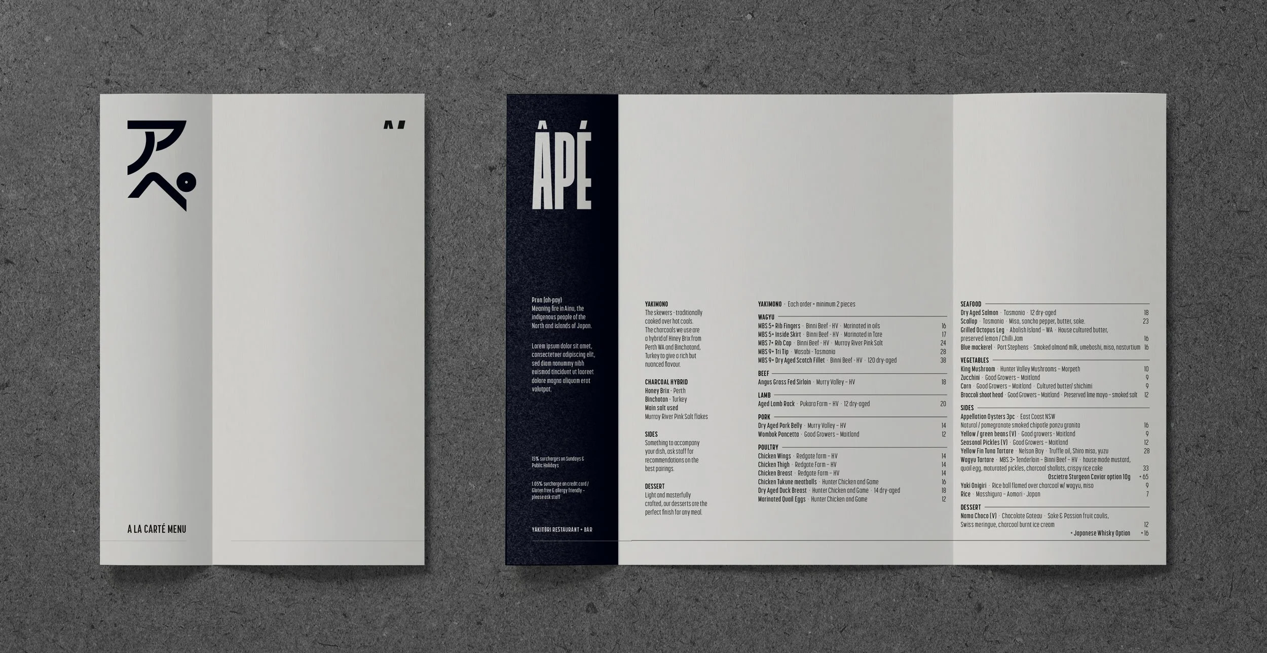
Âpé / ‘fire’ / アペ / ‘ah-pay’
Project Type : BRANDING & DESIGN
Role : ART DIRECTION / DESIGN / PRINT PRODUCTION
Âpé Yakitori
For Âpé, a high-end yakitori restaurant and bar, the design brief was to complement its exquisite food and whisky list with a minimal aesthetic. The name, meaning 'fire' in the Ainu language, subtly informed the branding, as fire is central to their culinary tradition. The challenge was to ensure the food remained the hero, aligning with the restaurant's sophisticated interior. Our solution delivered clean branding, cleverly utilising paper folds, textures, and a subtle 'flare' of orange - a direct link to fire and the venue's deep orange glow. The result is an elegant and understated brand that perfectly supports a truly elemental dining experience.
Food photography: Megann Evans