Family Owned, Family Operated
Project Type : BRANDING & PACKAGING
Role : ART DIRECTION / DESIGN / ILLUSTRATION / PRINT PRODUCTION
Keith Tulloch Wine
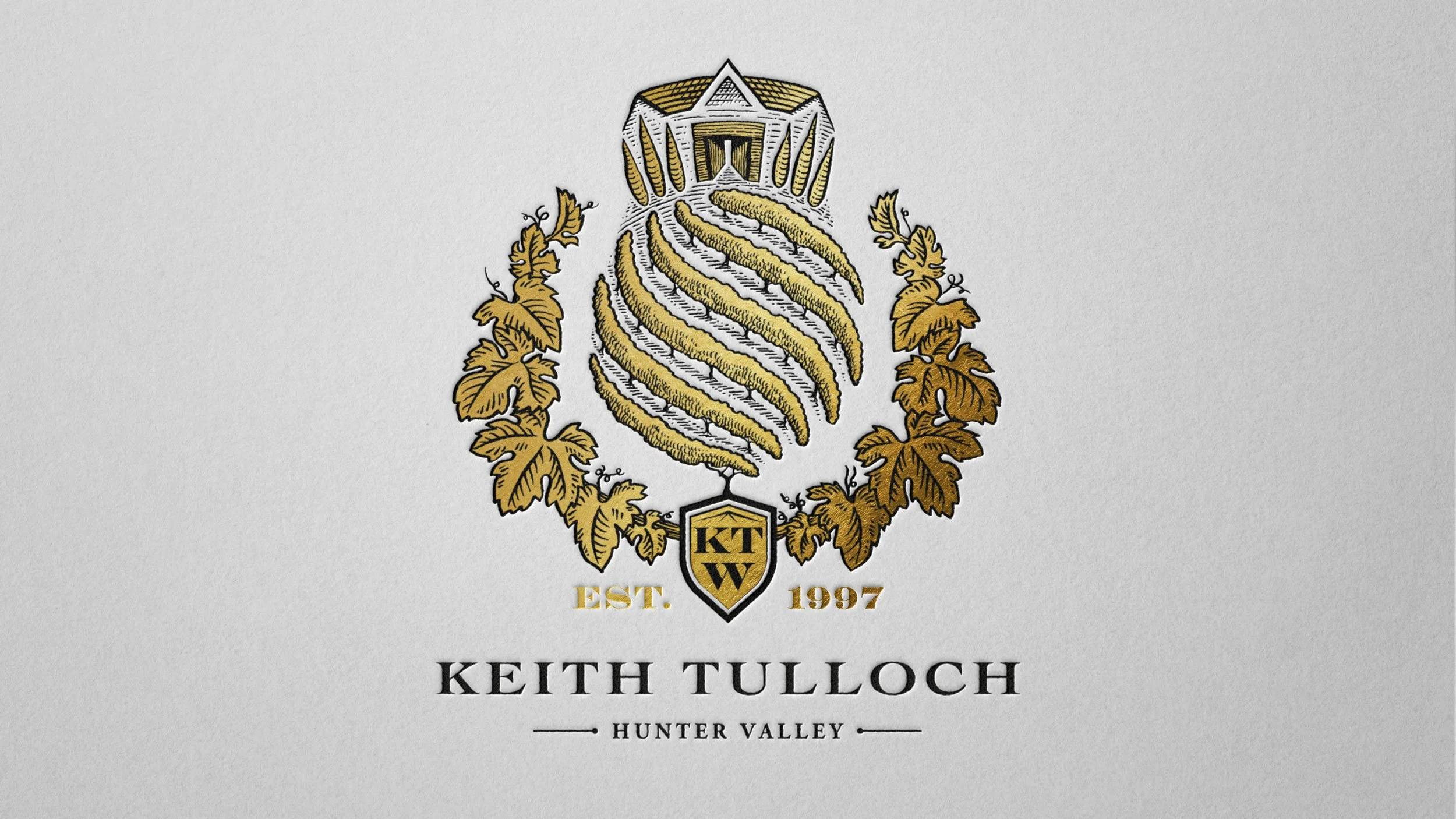
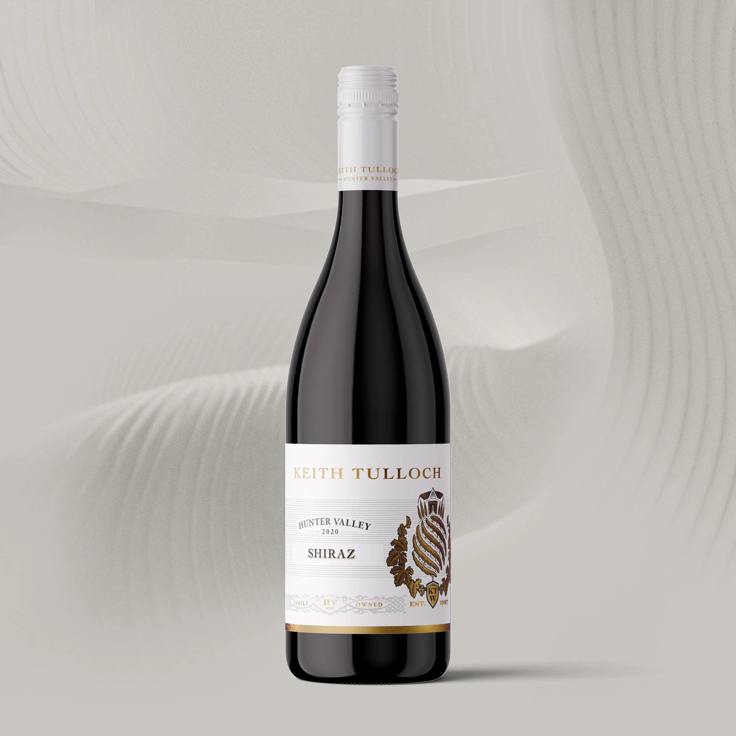
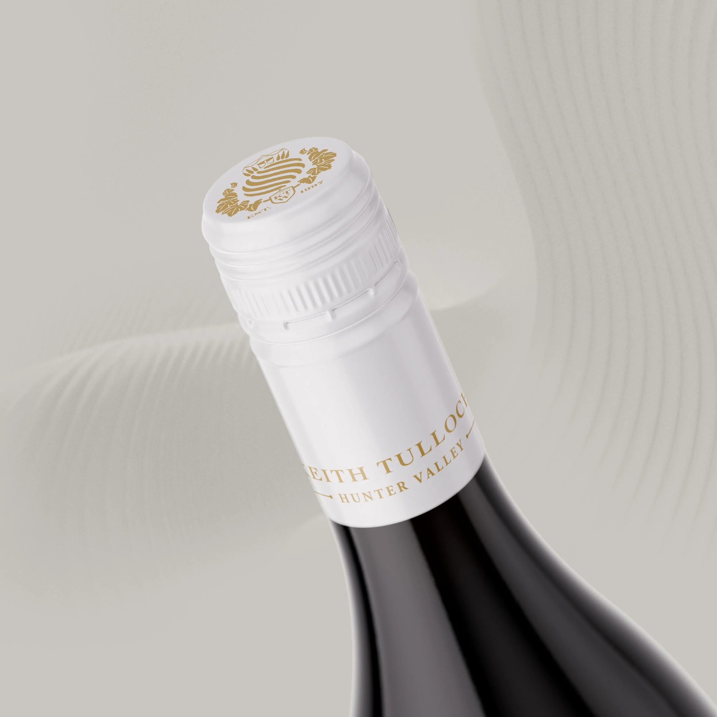
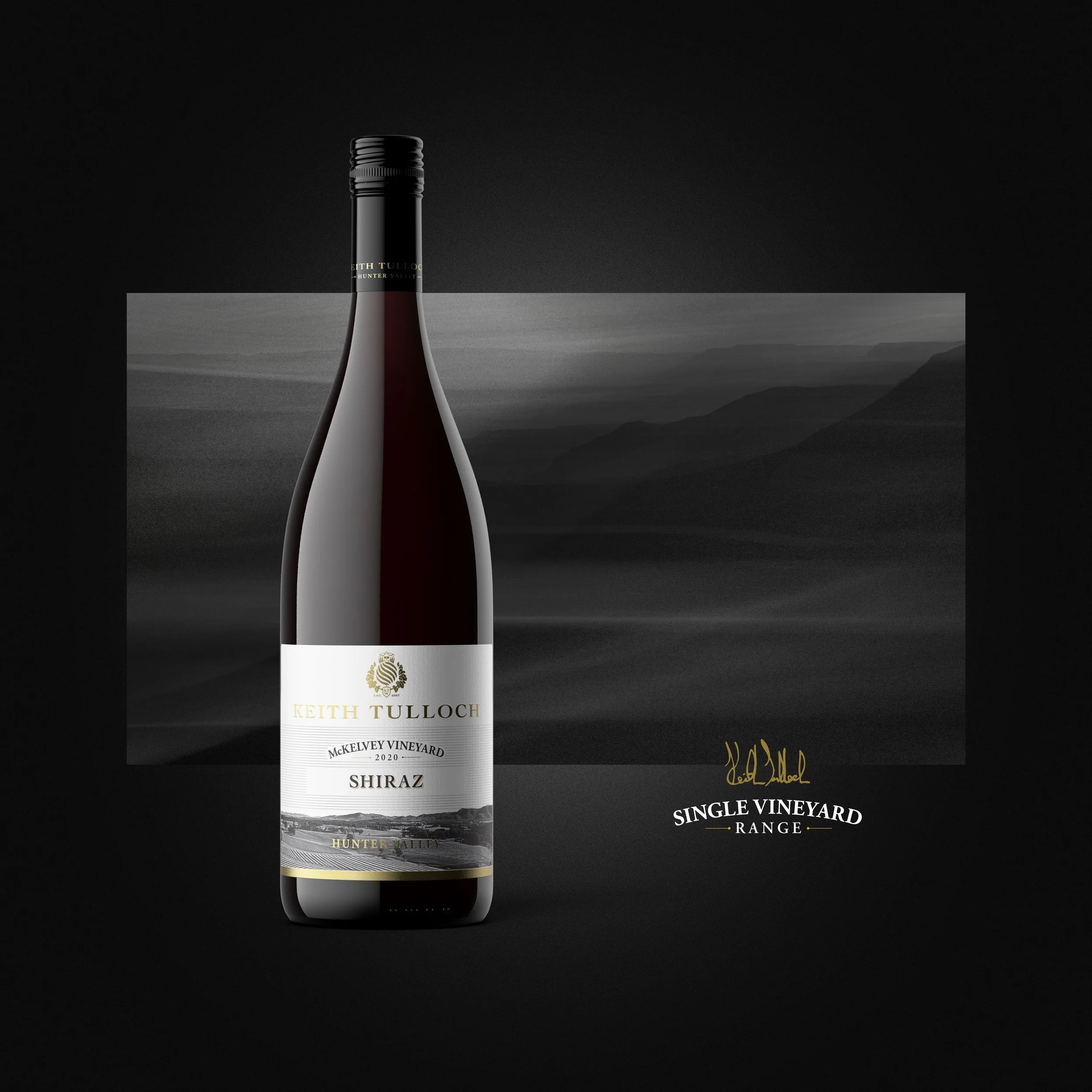
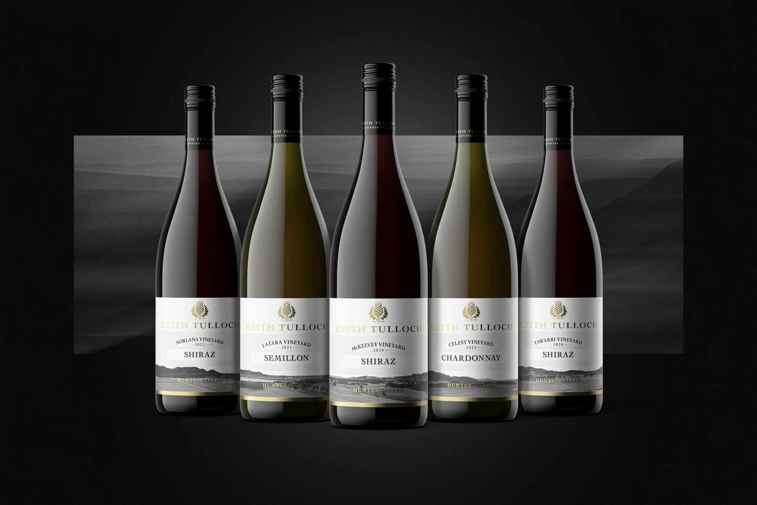
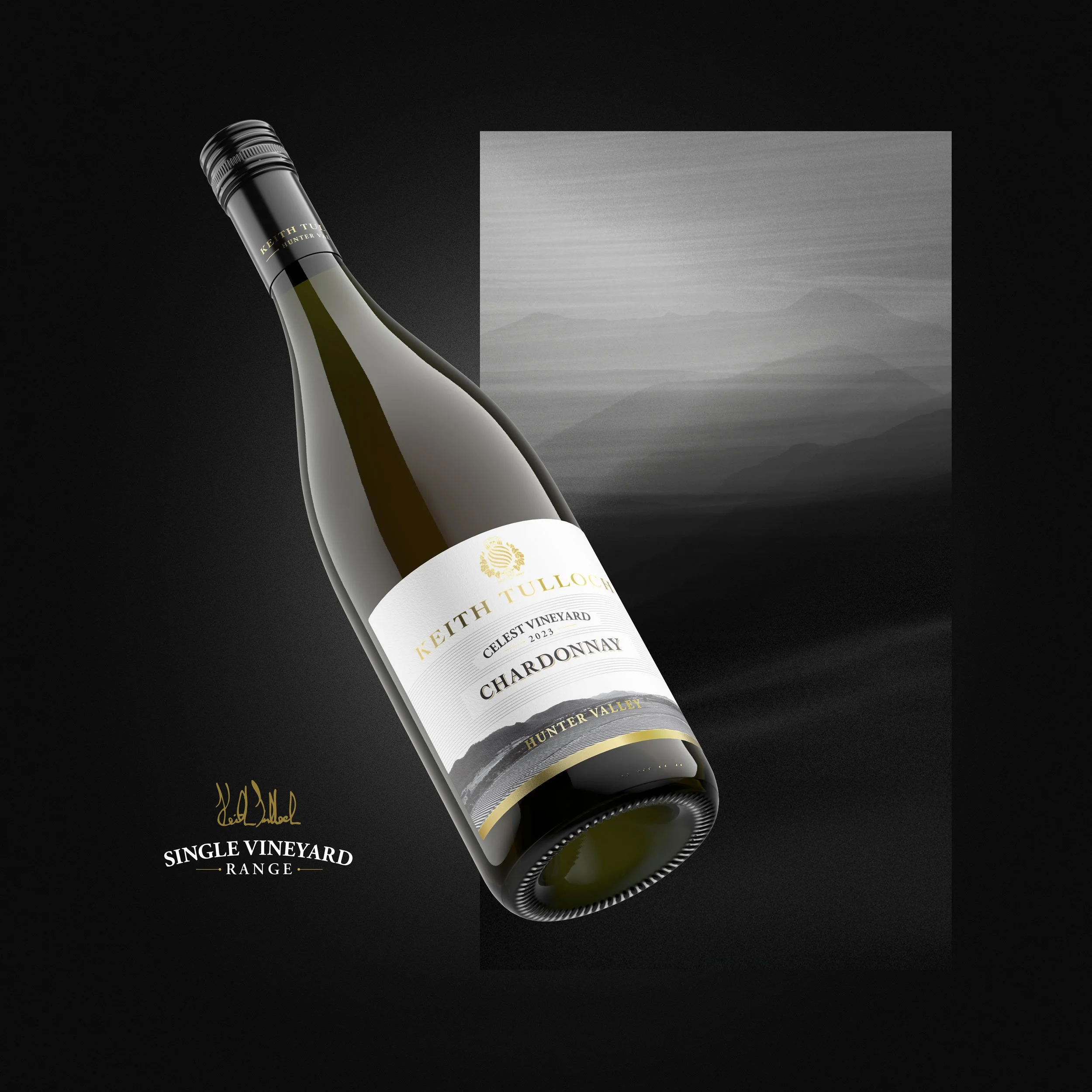
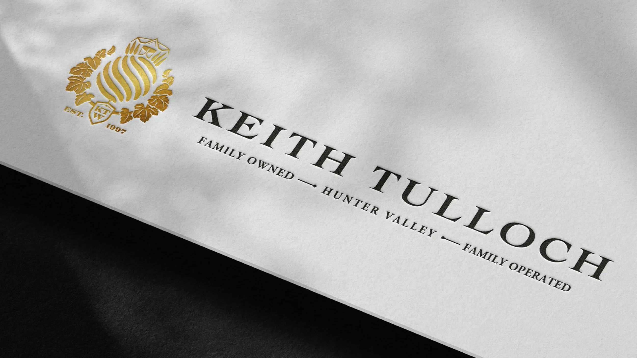
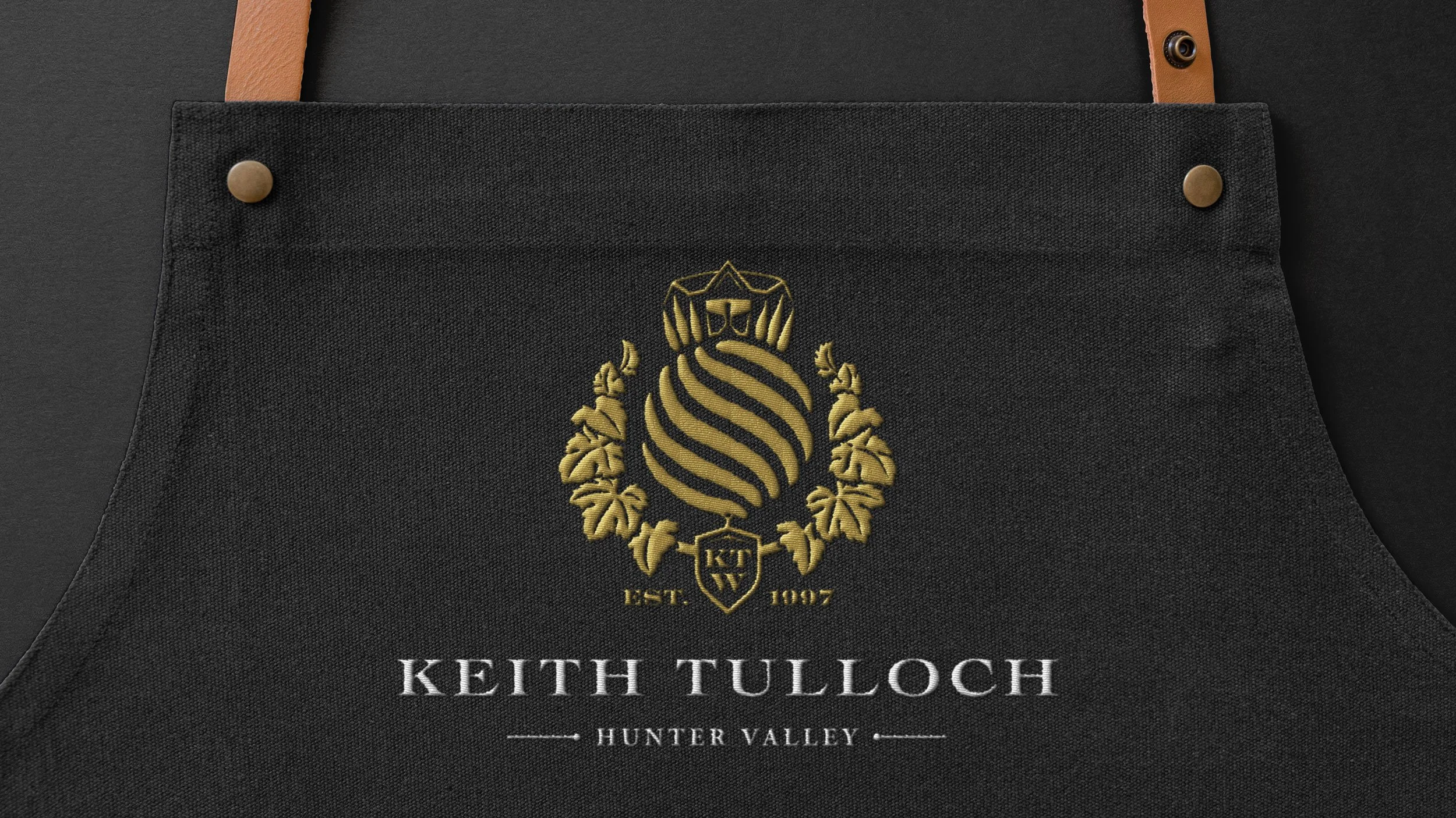
From their iconic Pokolbin estate, 4th-generation winemaker Keith Tulloch and his family craft celebrated Hunter Valley wines, guided by a simple ethic: 'good, better, best'. They approached Side B to refresh their brand, seeking an authentic identity that would capture their commitment to family, place and sustainable winemaking. At the heart of the brand was the creation of a new emblem. We transformed the previous logo - a simple Scottish thistle - into a powerful symbol of the four pillars of their brand: the estate, the winery, the vines, and the Tulloch family. This new emblem became the cornerstone for updated packaging, inspiring a smart refresh for the Hunter Valley range and terroir-driven labels for their Single Vineyard wines.

